Q1
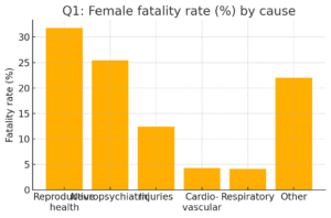
Data (percentages):
Reproductive health 31.8, Neuropsychiatric 25.4, Injuries 12.4, Cardiovascular 4.3, Respiratory 4.1, Other 22.0.
(i) Graphical representation — see the bar chart titled “Q1: Female fatality rate (%) by cause”.
(ii) Major cause: Reproductive health conditions (31.8%) — highest percent.
(iii) Two major contributing factors (common, textbook-level):
• Poor access to maternal health services (antenatal care, skilled birth attendance) — increases maternal morbidity and mortality.
• Unsafe abortions/limited reproductive health education in parts of the world — contributes substantially to reproductive-health-related fatalities.
Q2
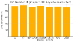
Data (girls per 1000 boys): SC 940, ST 970, Non SC/ST 920, Backward districts 950, Non-backward 920, Rural 930, Urban 910.
(i) Bar graph — see “Q2: Number of girls per 1000 boys”.
(ii) Classroom conclusions (examples you can discuss):
• ST area shows the highest (970) and Urban the lowest (910) — indicates regional/social differences.
• Overall values cluster near 920–970, but small differences may reflect socio-economic, health, or reporting differences.
• Backward districts show slightly better figure (950) than non-backward (920) — suggests local policies/programs might be effective in some places.
Q3
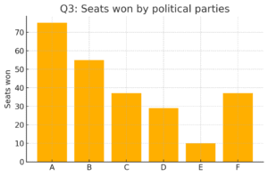
Seats: A 75, B 55, C 37, D 29, E 10, F 37.
(i) Bar graph — see “Q3: Seats won by political parties”.
(ii) Party A won the maximum (75 seats).
Q4
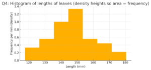
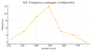
Lengths of 40 leaves (mm) in class-intervals:
118–126: 3; 127–135: 5; 136–144: 9; 145–153: 12; 154–162: 5; 163–171: 4; 172–180: 2.
(i) Histogram — I converted the discrete classes to continuous (by making class edges continuous) and drew a histogram where area = frequency. See “Q4: Histogram …”.
(ii) Another suitable representation: frequency polygon (I also plotted it using midpoints).
(iii) Is it correct to conclude maximum number of leaves are 153 mm long? No. The class 145–153 has the maximum frequency (12 leaves), but that only tells us that most leaves fall somewhere in that interval; it does not mean the exact value 153 mm itself occurs most often.
Q5
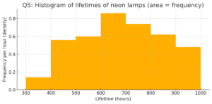
Life times of 400 neon lamps (hours):
300–400:14, 400–500:56, 500–600:60, 600–700:86, 700–800:74, 800–900:62, 900–1000:48.
(i) Histogram — plotted as area-proportional bars (area = frequency). See “Q5: Histogram of lifetimes…”.
(ii) How many lamps have a life time of more than 700 hours?
I used the usual grouped-interval approach and summed frequencies of classes from 700–800 onward:
74 (700–800) + 62 (800–900) + 48 (900–1000) = 184 lamps.
(If your interpretation of “more than 700” excludes exactly 700 hours you could refine, but with grouped data the standard approach is to include the whole 700–800 class.)
Q6
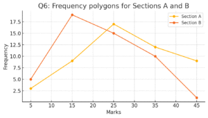
Two sections distribution (marks):
Section A: 0–10:3, 10–20:9, 20–30:17, 30–40:12, 40–50:9.
Section B: 0–10:5, 10–20:19, 20–30:15, 30–40:10, 40–50:1.
I plotted two frequency polygons on the same graph (midpoints used). See “Q6: Frequency polygons for Sections A and B”.
Comparison (from polygons):
• Section B has higher frequency in 10–20, but Section A dominates in 20–30 and above — overall Section A performs better in higher-mark classes (more students in 20–50 ranges). Section B has a concentration at 10–20.
Q7
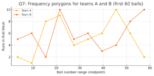
Runs scored by teams A and B over 10 blocks of 6 balls (first 60 balls). I first used class midpoints and plotted both frequency polygons on the same graph. See “Q7: Frequency polygons for teams A and B”.
Use the plot to compare play-by-play: where one team scores more in particular blocks, etc.
Q8
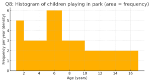
Number of children by age groups: 1–2:5, 2–3:3, 3–5:6, 5–7:12, 7–10:9, 10–15:10, 15–17:4.
I drew a histogram with variable-width classes, plotting heights as frequency/width so area equals frequency. See “Q8: Histogram of children…”.
Q9
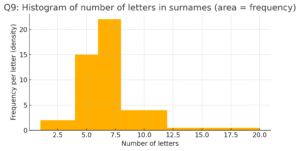
Surnames (100 total) vs number of letters: 1–4:6, 4–6:30, 6–8:44, 8–12:16, 12–20:4.
(i) Histogram — plotted with varying widths and heights = frequency/width so area = frequency. See “Q9: Histogram of number of letters…”.
(ii) Class interval with maximum surnames: 6–8 (frequency 44).